

Texture contrast is defined as the deliberate pairing of fabrics with different surface qualities, such as matte versus sheen or smooth versus napped weaves, to create visual depth in an outfit. This principle goes far beyond color. A silk blouse worn with wool trousers does more than look polished. It creates a dynamic interplay of light and shadow that makes the entire look feel intentional and alive. Understanding why texture contrast enhances outfits gives you a repeatable tool for building looks that hold attention, read as high quality, and work across a wide range of occasions.
Why does texture contrast enhance outfits visually?
Texture contrast works at the level of perception, not just aesthetics. A 2026 Optica study found that surface texture most strongly impacts perceived lightness when fabrics differ. That means two pieces in the same color can look like entirely different shades simply because one is matte and the other has sheen.
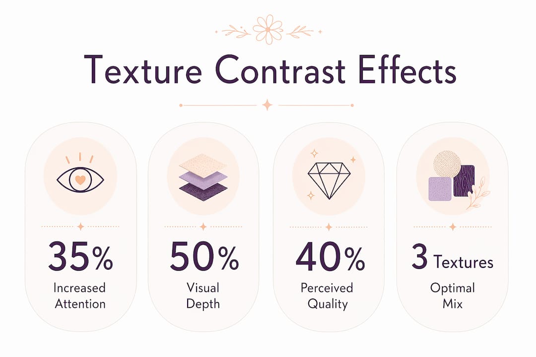
The effect on the eye goes even deeper. A 2026 MDPI eye-tracking study found that shorter time-to-first-fixation and longer fixation duration predicted higher desirability in textured outfits. Put plainly, the eye lands faster and stays longer on outfits that mix textures. That translates directly into an outfit reading as more interesting and more put-together.
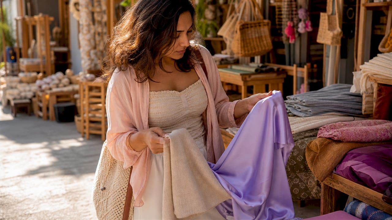
Contrast in design also creates visual hierarchy, which is the ability of the eye to distinguish one element from another. Without hierarchy, an outfit reads as a single flat shape. With texture contrast, each garment layer becomes its own visual zone, giving the look structure and dimension.
Here is what texture contrast does at the perceptual level:
- Alters color perception. The same navy reads differently on a matte crepe versus a satin finish, making the outfit feel richer without changing a single color.
- Increases visual engagement. The eye fixates faster and lingers longer on mixed-texture outfits, which is why they feel more memorable.
- Creates visual hierarchy. Distinct textures separate garment layers, so the eye can read the outfit as a composition rather than a blur.
- Adds dimensionality. Matte, sheen, and textured surfaces create dynamic light patterns that shift with movement and lighting conditions.
Pro Tip: Pair a matte fabric with one that has a slight sheen rather than a full gloss. The contrast reads as sophisticated rather than costume-like, and it works in both daylight and artificial light.
Why is texture contrast crucial in monochromatic outfits?
Monochromatic dressing is one of the most powerful style moves available, but it carries a real risk. Without color contrast to separate garments, an all-one-tone look can collapse into a flat, shapeless silhouette. Texture contrast is the tool that prevents that.
Fashion analysis from 2026 confirms that in tonal and monochrome looks, texture provides the essential visual depth that color cannot. Matte textures alone flatten the outfit. Mixing sheen and matte creates richness even when every piece shares the same hue. This is why an all-cream outfit built from a silk camisole, a linen blazer, and a ribbed knit skirt reads as curated rather than washed out.
Light interaction is the mechanism behind this effect. A Cornell Chronicle report on fabric rendering shows how different surfaces produce highlight and shadow variations that increase perceived dimensionality. A satin blouse catches light at the shoulder. A wool trouser absorbs it at the hip. That difference alone creates the illusion of shape and structure.
The table below shows how different fabric pairings perform in a monochromatic outfit:
| Fabric pairing | Light behavior | Visual result |
|---|---|---|
| Matte crepe + matte linen | Both absorb light equally | Flat, underdeveloped look |
| Matte crepe + silk charmeuse | Absorb vs. reflect | Rich depth, strong contrast |
| Ribbed knit + satin | Raised texture vs. smooth sheen | Dimensional, polished finish |
| Tweed + leather trim | Napped vs. smooth | Structured, high-quality feel |
Pro Tip: When building a monochrome outfit, choose at least one fabric that reflects light and one that absorbs it. That single decision adds more visual interest than switching to a second color.
How to combine textures for stylish, modern outfits
Mixing textures effectively follows a structure, not a guessing game. The most reliable method uses three zones of visual weight: a dominant base, a highlight texture, and a grounding texture.
-
Start with a matte base. A matte fabric, such as cotton, crepe, or brushed denim, anchors the outfit. It absorbs light and creates a neutral visual foundation that lets other textures stand out. Think of it as the background layer in a composition.
-
Add a highlight texture. This is the piece with the highest light interaction. Silk, satin, faux leather, or a metallic knit all qualify. The highlight texture draws the eye and creates the primary point of contrast. A silk blouse over matte trousers is the simplest version of this principle in action.
-
Ground with a mid-weight texture. A knit cardigan, a tweed jacket, or a woven belt adds a third surface that bridges the base and the highlight. This prevents the outfit from feeling like two competing pieces and instead creates a layered, intentional look.
The most common mistake is using multiple textures that are too similar in finish. Mixing fabrics with near-identical light behavior reduces the foreground and background cues the eye needs to read the outfit as dimensional. Three matte fabrics in different colors still produce a flat result. The fix is always to vary light behavior, not just fabric type.
Practical pairings that work across seasons include silk with leather, knit with tweed, satin with raw cotton, and velvet with structured wool. Each pairing follows the same logic: one fabric reflects, one absorbs, and the contrast does the visual work. For ideas on building these combinations across different occasions, the outfit-building guide from Wildflowerwardrobe is a strong starting point.
Choosing fabric pairs that differ significantly in light behavior, such as matte versus sheen or smooth versus napped, produces maximum perceived contrast even when color stays identical. That is the core principle behind every successful texture-mixed outfit.
How texture contrast affects perceived quality and versatility
Texture contrast signals effort and curation. An outfit built from fabrics that interact differently with light reads as more considered than one assembled from similar surfaces, even if the price points are identical. Styling experts confirm that texture contrast can elevate affordable fashion without relying on color or pattern to carry the look.
The attention effect is measurable. Industry research shows that texture contrast can increase the time spent looking at an outfit by up to 40%. Longer viewing time correlates directly with higher perceived value. That is why stylists and retailers consistently use texture mixing to make pieces feel more premium on the floor and in editorial shoots.
Texture contrast also builds wardrobe versatility in a practical way. A single silk blouse can anchor a casual look when paired with a chunky knit, shift to office-ready when worn under a structured blazer, and read as evening-appropriate over tailored satin trousers. The blouse does not change. The texture contrast around it does all the work.
The benefits of building a texture-aware wardrobe include:
- Trend resistance. Texture contrast is a design principle, not a trend. It works in every season and across every color palette.
- Fewer pieces, more looks. One high-contrast texture piece multiplies the number of outfits available from the same wardrobe.
- Perceived luxury. Mixed-texture outfits consistently read as more expensive and intentional, regardless of actual cost.
- Layering flexibility. Texture contrast naturally supports layering, which is the foundation of transitional season dressing and trend-proof styling.
Key Takeaways
Texture contrast is the single most effective tool for adding visual depth, perceived quality, and versatility to any outfit without changing color or spending more.
| Point | Details |
|---|---|
| Texture changes color perception | The same hue reads differently on matte versus sheen fabrics, adding richness without new colors. |
| Eye-tracking confirms engagement | Outfits with texture contrast attract faster fixation and hold attention longer, reading as more desirable. |
| Monochrome looks need texture | Without texture contrast, tonal outfits flatten; mixing matte and sheen creates essential depth. |
| Use three visual weight zones | Anchor with a matte base, add a highlight texture, and ground with a mid-weight fabric for balance. |
| Texture contrast signals quality | Mixed-texture outfits read as more curated and expensive, regardless of actual price point. |
What I have learned from years of styling with texture
The most underrated move in fashion is not a new color palette or a statement piece. It is learning to read a fabric’s surface before you buy it. I spent years assembling outfits that looked fine in the mirror but fell flat in photos or under different lighting. The problem was almost always the same: every piece had a similar matte finish, and the look had no dimension.
The shift happened when I started treating texture the way a painter treats value. Before adding anything to an outfit, I ask whether it reflects or absorbs light. If everything in the look absorbs, I swap one piece for something with sheen. That single habit changed how my outfits photograph, how they read in a room, and how long people actually look at them.
The mistake I see most often is buying textures that feel different to the touch but behave identically under light. A ribbed cotton and a waffle knit are tactilely distinct, but they both absorb light the same way. Pairing them produces a flat result despite the variety. The fix is always to introduce one piece with genuine light-reflective behavior, whether that is a satin trim, a leather belt, or even a metallic accessory.
My honest advice: start with a neutral color palette and force yourself to build interest through texture alone. It is harder than reaching for a bold print, but the results are more sophisticated and far more wearable across seasons. Once you train your eye to see light behavior in fabric, you cannot unsee it.
— Patrick
Wildflowerwardrobe pieces built for texture contrast
Texture contrast works best when you have the right pieces to build from. Wildflowerwardrobe carries a curated selection of women’s clothing and accessories specifically suited to this approach, from satin blouses and ribbed knitwear to suede bags and embellished dresses that introduce rich surface variety into any look.

The women’s casual wear collection at Wildflowerwardrobe includes pieces across a range of fabric finishes, making it straightforward to build the matte base, highlight texture, and grounding layer that every strong outfit needs. For a finishing touch that adds textural contrast at the accessory level, the Fame Heart and Tassel Accent Suede Shoulder Bag brings a napped, light-absorbing surface that pairs beautifully against silk or satin. Wildflowerwardrobe makes it easy to put these principles into practice with pieces that are already doing the work.
FAQ
What is texture contrast in fashion?
Texture contrast in fashion is the pairing of fabrics with different surface qualities, such as matte and sheen or smooth and napped, to create visual depth and dimension in an outfit. It works by changing how light interacts with each garment, making the overall look more dynamic.
Does texture contrast work in monochromatic outfits?
Texture contrast is especially effective in monochromatic outfits because it provides the visual depth that color contrast cannot. Without it, tonal looks appear flat; mixing matte and sheen fabrics in the same color family creates richness and structure.
How many textures should I mix in one outfit?
Three textures is the most reliable number: a matte base, a highlight texture with light-reflective behavior, and a grounding mid-weight fabric. Using more than three textures with similar light behavior reduces contrast and flattens the look.
Can texture contrast make an outfit look more expensive?
Texture contrast consistently makes outfits read as more curated and high quality, regardless of price. Styling experts confirm that mixing fabrics with contrasting light behavior, such as silk with raw cotton, signals intentionality and elevates the perceived value of even affordable pieces.
What fabrics work best for texture contrast?
The most effective pairings combine one fabric that absorbs light, such as matte crepe, cotton, or wool, with one that reflects it, such as silk, satin, or faux leather. Adding a mid-weight texture like a knit or tweed completes the visual hierarchy.
0 comments